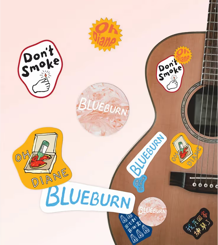
The design of Blueburn’s album art draws inspiration from the alternative music scene of the 1990s. Our approach reflects the nostalgic and raw essence of their sound by utilizing a palette of retro-inspired colors combined with a subtle grainy texture. The debut single delves into themes of personal conflict and contradictions, which we have visually represented through the contrasting elements of fire and ice.
The imagery of a melting ice cream cone held above a burning lighter and a cigarette extinguished in molten ice cream symbolizes the tension between something so innocent and sweet vs rebellion and bitter, creating a striking sense of collision and unease.
To complement this dynamic visual narrative, the typography features a bold and rugged style that mirrors the band's unfiltered sound.


